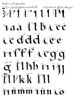
The Alphabet: This week I had been practicing the Carolingian Minuscule alphabet. It appeared in the late eighth century, within the scriptorium of Charlemagne. It was then spread into his other monasteries, and by the eleventh century it was widely adopted across Europe. It was created to improve the legibility of handwriting, as well as the uniformity of the alphabet. [1] [3] It's script is both round and sharp, and it's serifs are well defined. For your better understanding, I have attached a sample image of the alphabet below. [2]
Reflection: This week I was rather influenced by William Graily Hewit. He was a British calligrapher who had revived the art of gliding. His calligraphy flows together very well, and if you would like to know more, I have provided a link for you.
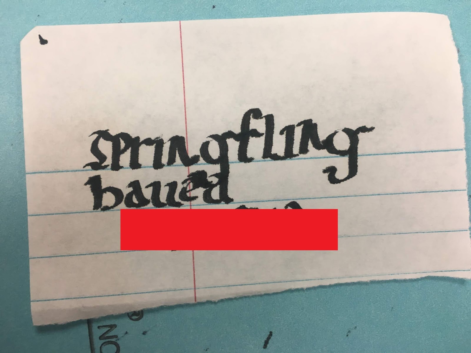
This week I decided to try something different, as I did not use guidelines. On top of it all I tried to glide my pen into each letter. I learned that not every word looks good being written in a gliding motion. I also learned that it is immensely difficult to write straight across the paper without a guideline. I rather enjoyed how the letter "e" flowed into the following character. What I didn't like about this alphabet however, was how the letter "S" is written. I was quite revolted by the letter, and chose not to use it most of the time.
Time-Frame: In total I practiced this alphabet for a little less than two hours. I am a little upset with myself for not meeting the two hour requirement, however I plan on putting a little bit of overtime into the next alphabet.
Progress: I started off this week a little shaky, however I cleaned up my work towards the end.
Attachments (Photos):
Note: None of the following images are in a particular order.
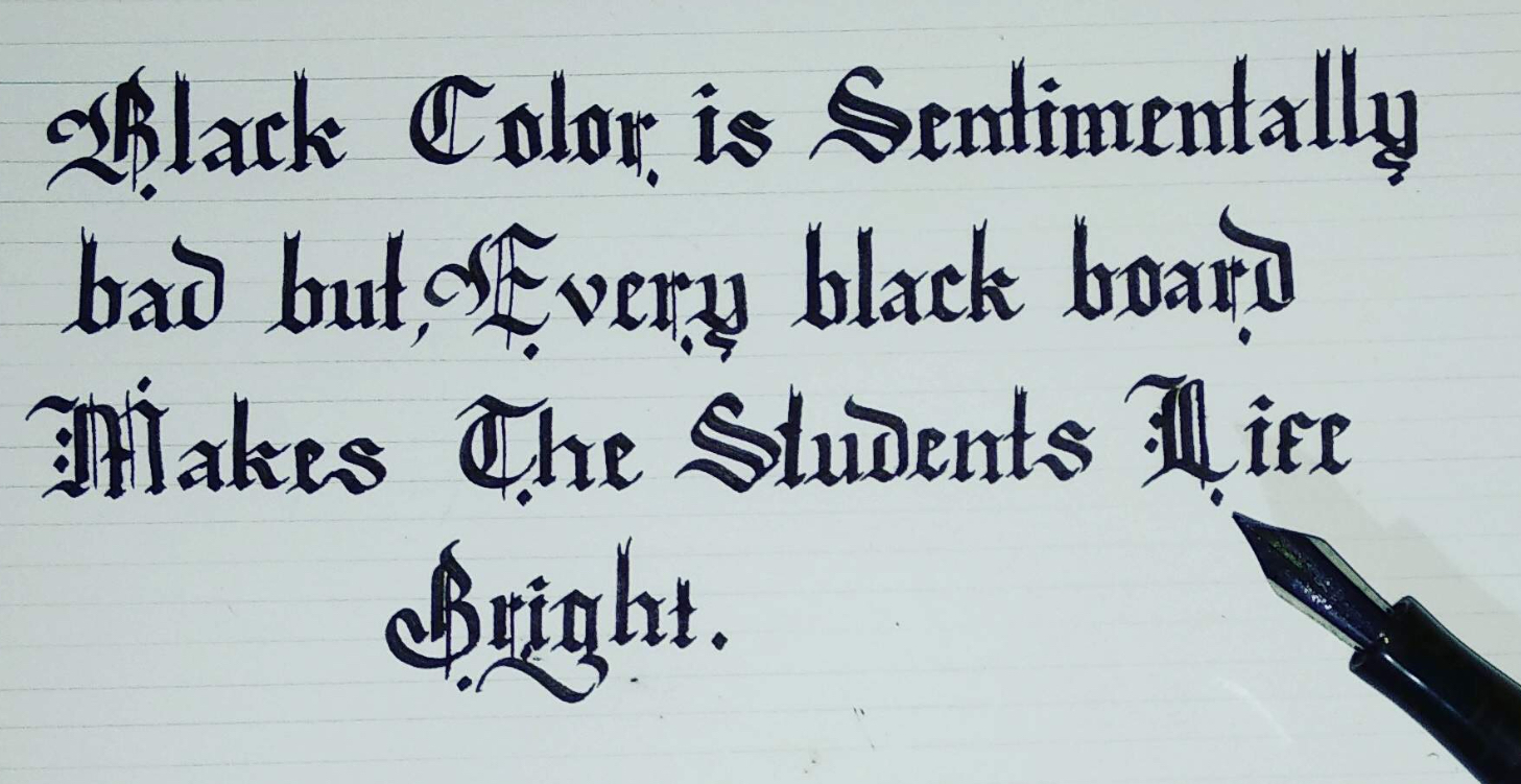
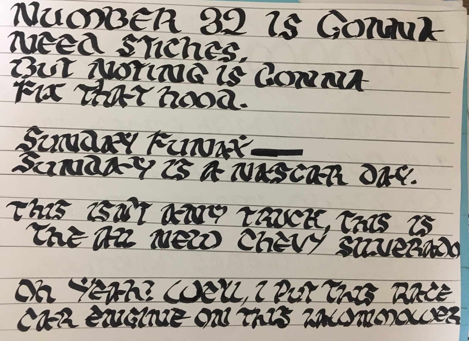
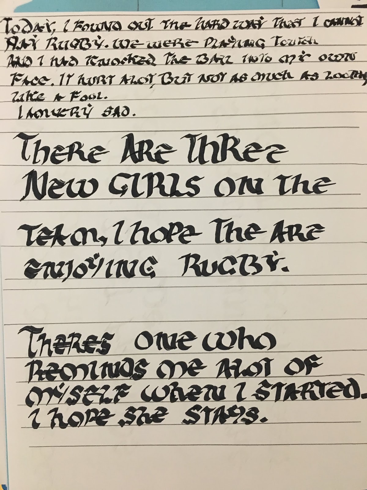
Practice:
Paper Used: Printer paper.
Pen Used: Y&C Calligraphy Pen; Size 3.5
Paper Used: Printer paper.
Pen Used: Y&C Calligraphy Pen; Size 3.5
Paper Used: Printer paper.
Pen Used: Y&C Calligraphy Pen; Size 3.5
Paper Used: Printer paper.
Pen Used: Y&C Calligraphy Pen; Size 3.5
Paper Used: Printer paper.
Pen Used: Y&C Calligraphy Pen; Size 3.5
Paper Used: Printer paper.
Pen Used: Y&C Calligraphy Pen; Sizes 2.5, 3.5
Exploration:
Paper Used: Printer paper.
Pen Used: Dip-pen and marker.
Paper Used: Lined paper.
Pen Used: Fountain pen.
Note: EDITED FOR CONFIDENTIALITY.
Citations:
[1] Tillotson, D. (2005, May 4). Caroline Minuscule. Retrieved February 26, 2019, from
http://medievalwriting.50megs.com/scripts/history5.htm
[2] McGavren, C. (2004). Carolingian aAlphabet [Digital image]. Retrieved February 25, 2019, from
http://cmcgavren.home.sprynet.com/azcarolingian_p1of2.html
[3] The Editors of Encyclopaedia Britannica. (2008, April 16). Carolingian minuscule. Retrieved
February 26, 2019, from https://www.britannica.com/art/Carolingian-minuscule


