
Image Source (URL)
This image was appealing to me because of how unique the "T" and "W" character is. The characters seem to flow together smoothly while still bearing their sharp edges. Finally, I really enjoyed how most of the letters have a gradient, it's almost as if the writer used a pen that always needed to be refilled with ink.
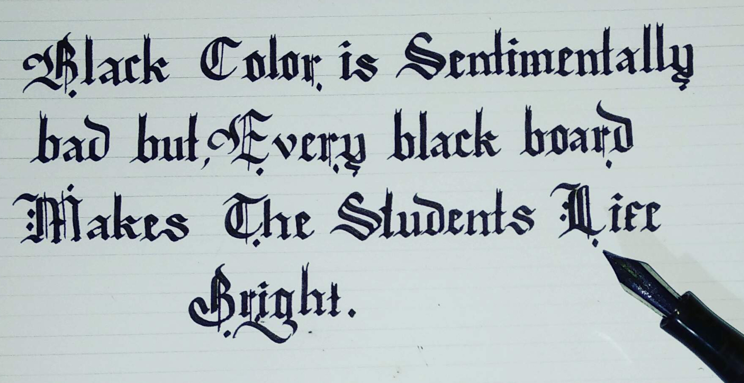
This image was appealing to me because of how sharp each letter is. The way each letter is written makes me think about old European musicians. It is this font, which comes into my head when anybody says "calligraphy."
No comments:
Post a Comment