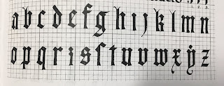
The Alphabet: This week I had been practicing the Gothic alphabet. In particular I had learned Gothic Script, specifically the Textura. This Gothic font was used to symbolize art and architecture, and spread all across Europe, except for Italy, by 1400. Gothic Textura, as well as Gothic Script is also known as "The Blackletter Typeface." [1][2] Gothic Textura is described as letters which weave together across the page, for your better understanding, I have provided an image below. This image is a picture of a document given to me in class, I could not find an alphabet online which contained the alphabet I used today. Thank you for understanding.
Reflection: This week I worked on Gothic Textura. I learned how these letters weave together in words. I also learned how to write this alphabet with both the dip and the fountain pen, in a way you cannot distinguish them. I really liked weaving words together, and how the capital letters look. However, I did not like how long these letters take to make.
Time-Frame: In total I practiced this alphabet for a little over two hours.
Progress: I started off this week only practicing the capital letters, shortly after moving onto lower case letters, and finally figured out how to write words.
Attachments (Photos):
Note: None of the following images are in a particular order.
Practice:
Paper Used: High quality laser printing paper.
Pen Used: Y&C CALLIGRAPHY, Size: 5.0, 3.5
Note: All I wrote was "Cheese Wh I wrote this as a joke." I am NOT taking credit for the background. Thank you for understanding.
Paper Used: Printing paper.
Pen Used: Dip pen and fountain pen.
Paper Used: Printing paper.
Pen Used: Y&C CALLIGRAPHY, Size: 5.0
Paper Used: Printing paper.
Pen Used: Y&C CALLIGRAPHY, Size: 3.5
Exploration
Note: I spent a lot of time this week exploring how to draw with these calligraphy markers, as well as a few other gothic fonts.
Pen Used: Expo Marker.
Paper Used: Whiteboard.
Note: I don't think the drawing counts as practice, however I wrote the words "Dakron", "Doc", and "Tidy" in a gothic font.
Pen Used: Y&C CALLIGRAPHY, Size: 3.5
Paper Used: Printer paper.
Citations:
[1] Farley, J., & Farley, J. (2009, November 07). The Blackletter Typeface: A Long And Colored History. Retrieved from https://www.sitepoint.com/the-blackletter-typeface-a-long-and-colored-history/
[2] Farwell, S. (2018). Textura. Retrieved March 5, 2019, from http://www.historygraphicdesign.com/a-graphic-renaissance/printing-comes-to-europe/7-textura-europe


No comments:
Post a Comment