Wednesday, April 3, 2019

Symposium Research 2 - TOPIC: History of the Polish Communist Poster

Information:
Before the beginning of the Polish People's Republic, Poland had been subjected to numerous policies of cultural extermination as well as suppression by the Nazis. After the end of World War II, Poland's new leaders, the Soviets, would also implement their own version of this. 

Soviet suppression can be seen in early propaganda posters, marked by the realistic art form of the poster. These posters were used to help welcome the ideals of Communism, and to limit the artistic expression of the Polish people. Typically these posters only promoted communistic ideas, messages which had been approved by a censor, or they represented the government/people. These posters were created up until 1956, the end marked by both a more liberal regime led by Władysław Gomułka, as well as Joseph Stalin's death.
The year 1956 marked the beginning of new types of Polish poster art, as Soviet realism was no longer the only art form accepted. New predominantly western art styles appeared onto posters such as: geometric, abstract, minimalism, and surrealism. These styles were then promoted through major poster art schools such as: the Warsaw Polytechnic Institute, as well as the Warsaw Academy of Fine Arts. The Warsaw Polytechnic Institute would favor the geometric approach, while the Warsaw Academy of Fine Arts would favor more of a painterly one. Artists graduating from these schools were influenced in these new styles, leading to the bloom of new poster art. On top of it all, artists experienced more artistic freedom due to the new centralized film distribution authority. It was widely believed that once a film was approved by a censor, there was little to no need to have the film poster censored.

While artists had more artistic freedom, this did not remove them entirely from censorship. Artists were not allowed to be overly political, nor were they allowed to criticize the government.  To overcome this hurdle, artists highlighted their emotions and criticisms through symbolism. While it was not enough to get censored, it called for the Polish people to think for themselves.


Citation:
Pillardy, P. (2014, November 05). The Politics of Polish Poster Art under Communism.
Retrieved April 1, 2019, from https://curatedhams.wordpress.com/2014/11/05/the-politics-of-
polish-poster-art-under-communism/

Symposium Research 1 - TOPIC: Accessing Food in Communist Poland

Information:
Accessing food between the years 1952 and 1989 was difficult in the Polish People's Republic. Grocery stores were very small, typically with only one clerk. Their stock was very limited because they only stocked the "basics" in small quantities. They quickly sold out of bread, meat, and sugar; however, other items such as vinegar and vodka, were almost always accessible.
Accessing food became even more difficult when ration stamps were introduced on August 12th, 1976. These stamps were a tool for the government to control how much food the people brought, what they were able to buy, and who was able to buy food. All of these factors were based on the citizens age and profession. By 1981, meat was only available for purchase through these stamps. Since grocery stores quickly sold out, the people often turned to unofficial sellers for "high demand" food items. This action was so widespread across Poland, it was almost impossible to discourage by law; as it could not be enforced. Another way the people got around buying food with stamps was raising carp in their homes. It was easy to raise, leading it to become a staple in traditional Polish cuisine.
As briefly mentioned in the previous paragraph, vodka was almost always accessible in grocery stores.  However, other types of alcoholic drinks such as beer and wine, were rarely available. Polish citizens would use ration stamps for vodka, or any other kind of alcohol they could get as well as food. When the people ran out of stamps, they made bimber in their homes; an alcohol typically made out of sugar, grain, or potatoes.

Citation:
Staga, D. (2014, November 3). The Communist Regime in Poland in 10 Astonishing Pictures.
Retrieved April 1, 2019, from https://culture.pl/en/article/the-communist-regime-in-
poland-in-10-astonishing-pictures

Sunday, March 10, 2019

History: 14th Century Humanistic Script


During the thirteenth century gothic script was getting outdated. Scribes would ask for copies written in "littera […] castigata et clara" meaning "neat and clean letters." The problem with gothic script was that it was hard to read, and readers preferred a cleaner script. It was called "barbaric" at times, and it was undesirable to the Italians. This would lead to the Italian development of the Humanistic script, leading to it's success in the fourteenth and fifteenth century. This script's origin is unknown, however it it widely believed that either Niccolò Niccoli or Poggio Bracciolini were the first to influence it's development. Afterwards, the Humanistic script developed variants all thanks to Coluccio Salutati. Coluccio was well known for creating and practicing many different types of script, and it is theorized that he influenced both Niccolò Niccoli and Poggio Bracciolini before the scripts development. This would lead to the scripts variants. Another important figure was Vespasiano da Bisticci, a bookseller who sold books written in Humanistic script across the western worldespasiano da Bisticci was not the only way this script was widely spread, the Roman Catholic Church had taken a liking to this script and had their bibles written in it. I n the end, this script had influenced the creation of two modern typography fonts: Italic and Roman.

Citation:

Menna, G., & De Vos, M. (2019). Humanistic Script - The story of the writing style of the Renaissance. Retrieved March 10, 2019, from https://sexycodicology.net/blog/codicology/medieval-scripts/humanistic-script/

Tuesday, March 5, 2019

Calligraphy: Gothic Textura


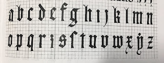
The Alphabet: This week I had been practicing the Gothic alphabet. In particular I had learned Gothic Script, specifically the Textura. This Gothic font was used to symbolize art and architecture, and spread all across Europe, except for Italy, by 1400. Gothic Textura, as well as Gothic Script is also known as "The Blackletter Typeface." [1][2] Gothic Textura is described as letters which weave together across the page, for your better understanding, I have provided an image below. This image is a picture of a document given to me in class, I could not find an alphabet online which contained the alphabet I used today. Thank you for understanding.


Reflection: This week I worked on Gothic Textura. I learned how these letters weave together in words. I also learned how to write this alphabet with both the dip and the fountain pen, in a way you cannot distinguish them. I really liked weaving words together, and how the capital letters look. However, I did not like how long these letters take to make.

Time-Frame: In total I practiced this alphabet for a little over two hours.

Progress: I started off this week only practicing the capital letters, shortly after moving onto lower case letters, and finally figured out how to write words.


Attachments (Photos):
Note: None of the following images are in a particular order.

Practice:
Paper Used: High quality laser printing paper.
Pen Used: Y&C CALLIGRAPHY, Size: 5.0, 3.5
Note: All I wrote was "Cheese Wh I wrote this as a joke." I am NOT taking credit for the background. Thank you for understanding.

Paper Used: Printing paper.
Pen Used: Dip pen and fountain pen.

Paper Used: Printing paper.
Pen Used: Y&C CALLIGRAPHY, Size: 5.0


Paper Used: Printing paper.
Pen Used: Y&C CALLIGRAPHY, Size: 3.5


Exploration
Note: I spent a lot of time this week exploring how to draw with these calligraphy markers, as well as a few other gothic fonts.


Pen Used: Expo Marker.
Paper Used: Whiteboard.
Note: I don't think the drawing counts as practice, however I wrote the words "Dakron", "Doc", and "Tidy" in a gothic font.


Pen Used: Y&C CALLIGRAPHY, Size: 3.5
Paper Used: Printer paper.


Citations:

[1] Farley, J., & Farley, J. (2009, November 07). The Blackletter Typeface: A Long And Colored History. Retrieved from https://www.sitepoint.com/the-blackletter-typeface-a-long-and-colored-history/
[2] Farwell, S. (2018). Textura. Retrieved March 5, 2019, from http://www.historygraphicdesign.com/a-graphic-renaissance/printing-comes-to-europe/7-textura-europe

Sunday, March 3, 2019

History: Carolingian Renaissance

The British Islands in 410 CE evolved the roman scripts into variants of the finches in Galapagos script, which included upper and lower case letters. This would continue into the seventh and eighth century. During this era, Europe was a melting pot of rustic, uncial, and roman capitals when it came to writing. The roots of lowercase letters during this era, is marked by the writings of both the Luxeuil and Corbie monasteries. There was a steady decline of literacy, spelling, and grammar during this period; until Charles Short inherited the Frankish throne in 771. Charles would then rule that the court would follow the Church's time table and would then commission a new manuscript written  on vellum. This manuscript would have both uncials and Carolingian minuscule. Carolingian minuscule was the work over decades of developing a new clear script for writing. It was derived from half-uncial and insular scripts. It was so popular, in fact, that Alcuin, a noble teacher wrote his version of the bible in it. This bible would become a best seller, having over 100 copies being made in less than fifty years. The book itself was approximately 18" x 20.25" x 31" in dimension. When printers came into use by 1464, Carolingian minuscule also was used to print books in Italy.

Clayton, E. (2014). Roman Foundations. The golden thread: The story of writing  Berkeley, CA: Counterpoint. (pp. 55-60)

Wednesday, February 27, 2019

History: Viking Raids and Anglo Saxon Renewal


The vikings made a notable appearance in 793, when they terrorized all of north western Europe. They raided Lindisfarne in 793, a peaceful defenseless settlement, and moved south to Tours in 853.  By then any settlement by water, river or ocean, was under the viking threat. The vikings destroyed over fifty years worth of work inside the monasteries using fire or the blade of their swords, forcing  advances in the art of books to stop. However, Anglo-Saxon England would not stand to this new rule, and in 871 they recaptured England over the rule of King Alfred, the ruler of Wessex. This would cause a new monastic movement throughout England in 970, and English monks would rebuild monasteries, attached to churches. Carolingian minuscule would be used within these monasteries, with influence from the Anglo-Saxon style of writing. This script would be written in a thicker pen, and the serifs would have a rounded form. This would change in the eleventh century, when the letters would take more of an oval shape. This would then lead to the sharp shape of Gothic lettering. These achievements however, were threatened when England was concord by Duke William of Normandy.

Clayton, E. (2014). Roman Foundations. The golden thread: The story of writing  Berkeley, CA: Counterpoint. (pp. 60-63)

History: Growth of Christianity

The growth of Christianity and writing begins with the advancement of  the art of writing.
With the rumored Egyptian ban on the sale of papyrus  in 190BC, Pergamum librarians turned to writing in a codex; wax tablets which were bound together at the spine. This proved to be easier to read than scrolls, and by the sixth century the parchment codex was dominant. By the ninth century, papyrus was only used for administrative purposes.
Within these codices writing began to advance as well. One of the greatest advancements was the Origen's  creation of the "Hexapla" which would have: writings from the old testament, written in two languages (Hebrew and Greek,) in six columns lined side by side. This creation would lead St. Jerome to consult Origen's manuscript, and create the official text of the Roman Catholic church. Origen's "Hexapla," also influenced Pamphilus, who created the largest Christian library for their time, up until their death on Febuary 16th, 310. "Hexapla" still had influence even after Pamphilus's death, by a person named Eusbius.
Eusbius would create the Chronicle, a writing which incorporated tables and rational. It gave readers and writers a new visualization. His imagination as to how the codex could be formatted would lead to the creation of the Canon. The Canon divided the Gospel into ten sections, with tables listing passages, and linked it all together as one. It is because of this creation, he received a commission by Emperor Constantinople to furnish all the churches with Bibles. These Bibles were written in Greek uncials in a parchment codex. (Clayton, 2014, pp. 40-55)


Clayton, E. (2014). Roman Foundations. The golden thread: The story of writing  Berkeley, CA: Counterpoint. (pp. 40-55)