Sunday, March 10, 2019
History: 14th Century Humanistic Script
During the thirteenth century gothic script was getting outdated. Scribes would ask for copies written in "littera […] castigata et clara" meaning "neat and clean letters." The problem with gothic script was that it was hard to read, and readers preferred a cleaner script. It was called "barbaric" at times, and it was undesirable to the Italians. This would lead to the Italian development of the Humanistic script, leading to it's success in the fourteenth and fifteenth century. This script's origin is unknown, however it it widely believed that either Niccolò Niccoli or Poggio Bracciolini were the first to influence it's development. Afterwards, the Humanistic script developed variants all thanks to Coluccio Salutati. Coluccio was well known for creating and practicing many different types of script, and it is theorized that he influenced both Niccolò Niccoli and Poggio Bracciolini before the scripts development. This would lead to the scripts variants. Another important figure was Vespasiano da Bisticci, a bookseller who sold books written in Humanistic script across the western world. espasiano da Bisticci was not the only way this script was widely spread, the Roman Catholic Church had taken a liking to this script and had their bibles written in it. I n the end, this script had influenced the creation of two modern typography fonts: Italic and Roman.
Citation:
Menna, G., & De Vos, M. (2019). Humanistic Script - The story of the writing style of the Renaissance. Retrieved March 10, 2019, from https://sexycodicology.net/blog/codicology/medieval-scripts/humanistic-script/
Tuesday, March 5, 2019
Calligraphy: Gothic Textura
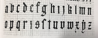
The Alphabet: This week I had been practicing the Gothic alphabet. In particular I had learned Gothic Script, specifically the Textura. This Gothic font was used to symbolize art and architecture, and spread all across Europe, except for Italy, by 1400. Gothic Textura, as well as Gothic Script is also known as "The Blackletter Typeface." [1][2] Gothic Textura is described as letters which weave together across the page, for your better understanding, I have provided an image below. This image is a picture of a document given to me in class, I could not find an alphabet online which contained the alphabet I used today. Thank you for understanding.
Reflection: This week I worked on Gothic Textura. I learned how these letters weave together in words. I also learned how to write this alphabet with both the dip and the fountain pen, in a way you cannot distinguish them. I really liked weaving words together, and how the capital letters look. However, I did not like how long these letters take to make.
Time-Frame: In total I practiced this alphabet for a little over two hours.
Progress: I started off this week only practicing the capital letters, shortly after moving onto lower case letters, and finally figured out how to write words.
Attachments (Photos):
Note: None of the following images are in a particular order.
Practice:
Paper Used: High quality laser printing paper.
Pen Used: Y&C CALLIGRAPHY, Size: 5.0, 3.5
Note: All I wrote was "Cheese Wh I wrote this as a joke." I am NOT taking credit for the background. Thank you for understanding.
Paper Used: Printing paper.
Pen Used: Dip pen and fountain pen.
Paper Used: Printing paper.
Pen Used: Y&C CALLIGRAPHY, Size: 5.0
Paper Used: Printing paper.
Pen Used: Y&C CALLIGRAPHY, Size: 3.5
Exploration
Note: I spent a lot of time this week exploring how to draw with these calligraphy markers, as well as a few other gothic fonts.
Pen Used: Expo Marker.
Paper Used: Whiteboard.
Note: I don't think the drawing counts as practice, however I wrote the words "Dakron", "Doc", and "Tidy" in a gothic font.
Pen Used: Y&C CALLIGRAPHY, Size: 3.5
Paper Used: Printer paper.
Citations:
[1] Farley, J., & Farley, J. (2009, November 07). The Blackletter Typeface: A Long And Colored History. Retrieved from https://www.sitepoint.com/the-blackletter-typeface-a-long-and-colored-history/
[2] Farwell, S. (2018). Textura. Retrieved March 5, 2019, from http://www.historygraphicdesign.com/a-graphic-renaissance/printing-comes-to-europe/7-textura-europe
Sunday, March 3, 2019
History: Carolingian Renaissance
The British Islands in 410 CE evolved the roman scripts into variants of the finches in Galapagos script, which included upper and lower case letters. This would continue into the seventh and eighth century. During this era, Europe was a melting pot of rustic, uncial, and roman capitals when it came to writing. The roots of lowercase letters during this era, is marked by the writings of both the Luxeuil and Corbie monasteries. There was a steady decline of literacy, spelling, and grammar during this period; until Charles Short inherited the Frankish throne in 771. Charles would then rule that the court would follow the Church's time table and would then commission a new manuscript written on vellum. This manuscript would have both uncials and Carolingian minuscule. Carolingian minuscule was the work over decades of developing a new clear script for writing. It was derived from half-uncial and insular scripts. It was so popular, in fact, that Alcuin, a noble teacher wrote his version of the bible in it. This bible would become a best seller, having over 100 copies being made in less than fifty years. The book itself was approximately 18" x 20.25" x 31" in dimension. When printers came into use by 1464, Carolingian minuscule also was used to print books in Italy.
Clayton, E. (2014). Roman Foundations. The golden thread: The story of writing Berkeley, CA: Counterpoint. (pp. 55-60)
Clayton, E. (2014). Roman Foundations. The golden thread: The story of writing Berkeley, CA: Counterpoint. (pp. 55-60)
Subscribe to:
Comments (Atom)


